 Yesterday, I told you the story of where the idea for Numb came from. Today, I thought I’d touch on another part of Numb‘s story, namely the cover.
People often comment on how cool the cover is, and I have to agree. I’ve been very blessed with all of my book covers so far in my career. But I thought I would share a little about where that cover came from. It actually started with the Advance Reader Copies.
The ARC Cover
We sent out advance reader copies of the book to reviewers. But we would need a cover to go with it. Jeff Gerke, the publisher for Marcher Lord Press, offered to design the cover for those himself and asked me if I had any ideas.
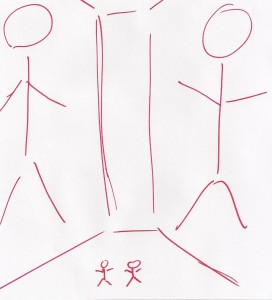
I could really only think of one idea, one that would basically replicate a pivotal scene in the book. I explained to Jeff which one I was thinking of, and then sent him this helpful sketch:
 I never claimed to have any artistic talent.
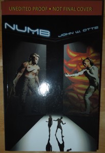
But Jeff got what I was thinking of. This is what he came up with for the ARC cover:
 Those of you who have read the book can probably guess which scene this is. Those of you who haven’t…well, sorry. Guess you’ll have to read the book.
So that took care of the ARCs. But what about the book when it’s released? Well, Jeff had an idea for that too.
The 99Designs Cover
Jeff had learned of a website called 99Designs, a place where graphic designers will compete for jobs in a sort of contest. Jeff had wanted to try it out and see what we’d get for the book. I figured we might as well give it a try. If I was going to be the guinea pig, so be it.
So Jeff set up the contest and in short order, we had hundreds of entries to sort through. Some of them were awesome. Some of them were okay. And some were, well…not. Every few hours, I would check the entries and send Jeff my thoughts and opinions.
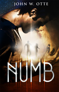
I still remember gasping when I saw the entry by a contestant with the handle “Portugal.” I loved it immediately. If I could, I would have had Jeff shut down the contest right then and there.
When the first round of the contest ended, Jeff posted a poll to ask people what they thought of a select few covers. Much to my delight, pretty much everyone chose the same cover I liked, namely this one:
 So in the end, it turned out pretty well. I got a phenomenal cover out of the deal.
But I also learned a few lessons about working with 99Designs. Literary agent Rachelle Gardner wrote an article about working with 99Designs, and it’s worth a read for authors thinking of publishing on their own. I want to add two thoughts from my experience with it as well:
1) You need to police the entries carefully. Early on in the contest, one designer submitted a design with three variants. It was a strong design, each one featuring a different sort of “take” on Crusader. One of the designs reminded me a bit too much of a video game character, namely Commander Shepard from the Mass Effect franchise. That happens to be one of my favorite franchises. Crusader’s armor was just a little too evocative of Commander Shepard’s. I mentioned this to Jeff when I saw it.
Shortly thereafter, several people commented that the designer had used a person’s Mass Effect fan art in his design. The other two covers incorporated fan art from other video game franchises as well. Jeff had to ask the designer to remove his submissions.
The next day, I noticed another cover that included imagery that looked familiar. Thankfully, I could take a look at the designer’s source material and I discovered that this designer used art from Mass Effect 3, stuff that I recognized. I quietly flagged the entry for violating intellectual property.
Those were the only two instances, but in a contest like this, I wonder how often stuff slips through.
2) Not everyone will behave professionally. There was one entrant in the contest who seemed to be the most enthusiastic. This person easily made the most submissions and was full of questions for Jeff about what we were looking for. This designer made it into the final round but, unfortunately, none of his designs were chosen.
That apparently upset his mother pretty badly.
Shortly after the design contest was over and I announced the winner on my Facebook page, someone popped up and left some rather nasty messages aimed at people who liked the winning cover. She accused the winning designer of soliciting votes for Jeff’s poll (which was ironic, since I found her on Twitter doing just that). It was fairly unpleasant until she settled down. She was the only one who reacted that way, but it was still a little disconcerting.
Now I don’t know if my experience is unique or not. It’s hard to say. But I can’t argue with the results. I still love this cover as much as when I first saw it.
Be sure to check out what the other tourists have to say:
Julie Bihn
Jennifer Bogart
Keanan Brand
Beckie Burnham
Pauline Creeden
Vicky DealSharingAunt
Carol Gehringer
Victor Gentile
Rebekah Gyger
Nikole Hahn
Jason Joyner
Carol Keen
Emileigh Latham
Rebekah Loper
Jennette Mbewe
Amber McCallister
Shannon McDermott
Shannon McNear
Meagan @ Blooming with Books
Rebecca LuElla Miller
Joan Nienhuis
Nissa
Faye Oygard
Writer Rani
Nathan Reimer
Jojo Sutis
Rachel Starr Thomson
Steve Trower
Shane Werlinger
Phyllis Wheeler
Nicole White


I voted for the winning one as well: despite not having read the book, I felt it was the mostly likely to grab me. However, Jeff’s design has me really curious about the book now. It’s next on my “to-read” list.
The cover is what made me read this book. And I’m so glad I did. Thanks for sharing, John.
I like the cover back-story. Reminds me of a bookmark contest at the library, so of those kids are really into winning and soliciting votes for their design.